While dark environments, such as Apple’s Mojave, or the default settings for Photoshop & Pixelmator Pro, may look fashionable, they are terrible for editing photos.
Why? Because they screw up your ability to see tones properly. Using a dark background will trick your mind into producing a print that has clogged up shadows, and is overall too dark.
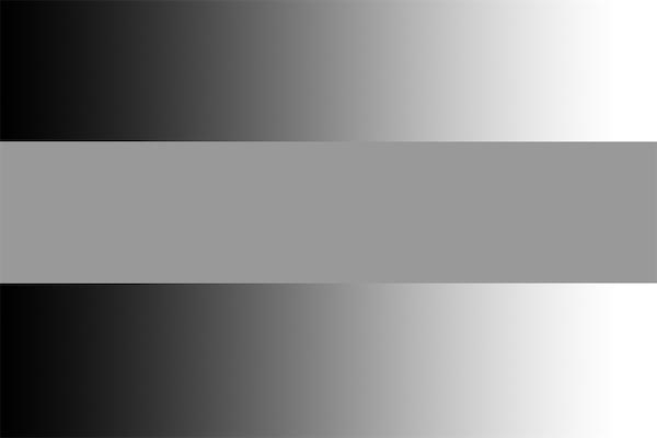
Don’t believe me? Check out the image below.

See that grey band in the middle? It is exactly the same shade of gray all the way across. The left end is NOT lighter than then right end.
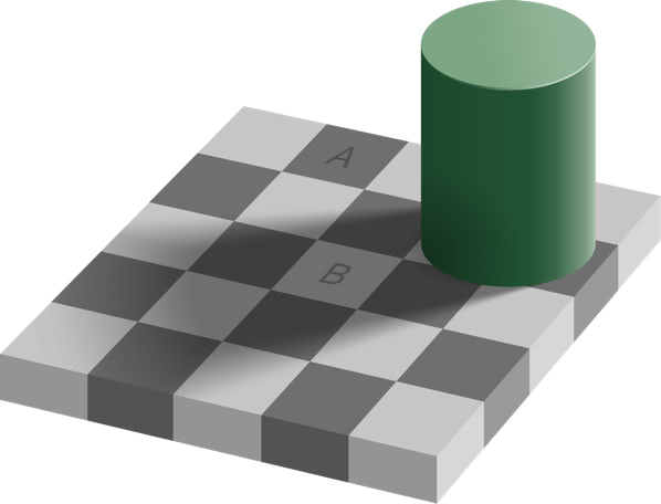
Take a look at squares A & B, below.

A & B are exactly the same shade of gray. (RGB 110, 110, 110).
It’s the way human perception is wired, and there’s nothing you can do about seeing those gray tones as different.
If you literally cannot see the tones correctly, you cannot edit your photos correctly, and you’ll never understand why your prints look too dark.
Set your editing tool to as light an environment as you can, and change the background to white, to keep your brain from messing with you!